
Constructive Critism Please

hey ryoko, i did a lot of photoshop coloring in my life (im a graphic designer).
Well, its hard to say by the net, but ill try to help ya with things i do.
-First, pass your original image (in case you made it in pencil pen, etc..) in some good degree of Levels (image<adjustment<levels) and make sure you have a good amount of black in the outline.
-The white background will probably become gray with the levels, so adjust the Contrast and brightness(image<adjustments<brightness/contrast), and you'll have a white background with black drawing lines.
-duplicate the layer. You'll work at the bottom layer, so put the layer above at Multiply, and do your colouring at the bottom layer (or more layers if you must). This will make your work A LOT EASIER, since the layer above will keep your outlines untouched.
-use the Polygonal Lasso tool to make quick selections of areas you wanna colour. You can do miracles by making these quick selection and adding some shade to them ( a cool way to do shadowing is: have your area selected, then use a difused Brush with a big size, far from the selected area. This will create a "spray-like" shadowing that doesnt look artificial.)
-use different layers everytime you can. you can put up some cool colour and layer mixing effects by using Blending modes at layers, such as multiply, overlay, colour burn etc..)
Hope it helps! Whenever i get the time i'll show ya some of my colouring at photoshop
Thats great!
An awesome thing to do also, is to fuse textured images into your colouring. See these images im putting here? These are pages frin a Children's Folklore book that i made with some friends. You can see that i used a lot of scaned textures (wood, fabric, snake skin, etc..) you just have to manipulate them into a colour that fits your artwork (good way to do: Image<adjustments<Hue/Saturation. If can either manipulate these colours directly or click Colorize).
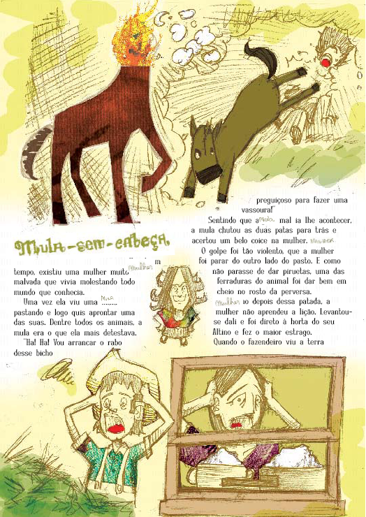
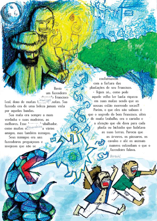
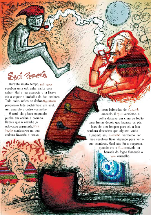
An awesome thing to do also, is to fuse textured images into your colouring. See these images im putting here? These are pages frin a Children's Folklore book that i made with some friends. You can see that i used a lot of scaned textures (wood, fabric, snake skin, etc..) you just have to manipulate them into a colour that fits your artwork (good way to do: Image<adjustments<Hue/Saturation. If can either manipulate these colours directly or click Colorize).
Heh. I think I've played CC three times now, and never got Glenn. Plain old guys with swords are so boring. Kid is my favorite 
Luiz's tip of keeping the outlines in a separate layer is a good one, although I think it'd be easier to just make it transparent in between the lines and keep it at Normal mode. When you do that, you don't need to pay as much attention to staying inside the lines in the lower layers.
Layers are good for lots of things because they allow you to manipulate stuff a lot without touching the original image. If you make a mistake, you only have to undo what you did to that layer. Shading and highlights are easily added with Burn/Dodge or Addition/Subtraction modes.
Do you use a tablet/pen? Then you can just sketch in the highlights if you want with a brush (either use pressure for opacity, or set it to something like 50% and use multiple strokes for more effect).
Lasso selections are handy to quickly limit a tool to some areas. If you're working at a high resolution (like scanned original artwork for example) that is. At low resolutions (like avatars), they're a pain to get exactly right without leaving some pixel artifacts. Selection by color is a good alternative, and you could always use the selection mask editor if you need really fine control.
Btw, I use the Gimp, not Photoshop, so I may get some terms different.
Last edited by Kimiko on Mon Apr 14, 2008 8:30 pm, edited 1 time in total.