SoM fanart :D

Expanding the Mana Universe. For fans, by fans.

Moderators: Faalstar, Kefka

Shuu
Green Drop
Posts: 67
Joined: Sun May 10, 2009 1:08 pm
Location: Philippines

Post by Shuu »

....and, edit!
"Later today" became "tomorrow", haha. XD Thanks again, NightshadeTea!
Image
Bigger here: http://i121.photobucket.com/albums/o220 ... hibis2.jpg


Image

Got inspired by the art of SoM mobile! I tried my best to copy the colors by eye, but I cheated a bit and eye-dropped a few. Haha! :'D Tons of mistakes, but really happy with the result! :heart:
Last edited by Shuu on Thu Jun 11, 2009 9:54 am, edited 1 time in total.
User avatar
Tekka
Emberman
Posts: 453
Joined: Sun Apr 05, 2009 4:19 pm
Location: Dark Side of The Light

Post by Tekka »

Nice work.
nick912012
Pebbler
Posts: 236
Joined: Tue Nov 07, 2006 4:23 pm
Location: Lebanon, Illinois

Post by nick912012 »

Looks really good there. I wish I could draw like that. My abilities extend out to slightly above stick people.
User avatar
manaman
Spikey Tiger
Posts: 1649
Joined: Tue Apr 10, 2007 5:06 am

Post by manaman »

Shuu,

I'd love to see more of your SoM fan art. These characters look fantastic! I wish you had made these into three separate images. . . . Just me. . . .

Peace,

manaman
Anise
Metal Crawler
Posts: 649
Joined: Tue Dec 09, 2008 12:56 am
Location: Don't you wish you knew.... *peers*

Post by Anise »

Beautiful fanart Shuu! Keep up the good work.
User avatar
Kimiko
Tropicallo
Posts: 1200
Joined: Tue Sep 25, 2007 3:14 am

Post by Kimiko »

Wow, that's great work Shuu! :D
User avatar
Dr. Sheexy
Site Admin
Posts: 3870
Joined: Sun May 21, 2006 9:49 pm
Location: Texas

Post by Dr. Sheexy »

Randi is kinda short, but you already know this :P

Great job on the little details, I think Popoie turned out the best.
Nice job on picking colors :P The purple shading like the mobile picture has is really pretty, but the more I look at Randi's hair the more I think the purple blends into his bandanna a bit too much.

But it still looks great!
User avatar
Duran
Spikey Tiger
Posts: 1859
Joined: Mon May 22, 2006 3:11 am
Location: Grasslands Country, Forcena

Post by Duran »

If you draw Duran from Seiken 3, I will love you forever!
Shuu
Green Drop
Posts: 67
Joined: Sun May 10, 2009 1:08 pm
Location: Philippines

Post by Shuu »

: O
Thanks for the nice comments!

Haha Sheexy, thanks for pointing that out! I fixed it a bit, better? :'D Also removed the background on this one...but the board shrinks the image a bit, so it is here: http://i121.photobucket.com/albums/o220 ... hibis2.jpg
Image


Duran, I'll try to draw as mush SD art as I can! Love love this series. :'D
User avatar
ytwars
Chess Knight
Posts: 146
Joined: Tue Nov 11, 2008 8:12 am
Location: Yuuzhan'tar

Post by ytwars »

Thats awesome!!
User avatar
Kassidy
Site Admin
Posts: 2975
Joined: Sun May 21, 2006 10:59 pm
Location: London, UK

Post by Kassidy »

Why yes, this artwork and the artist are indeed made of awesome! Love them!
NightshadeTea
Tomato Man
Posts: 151
Joined: Thu May 14, 2009 1:58 am

Post by NightshadeTea »

These are quite excellent! :D I love the style and the use of photoshop is far superior than anything I've ever been able to muster. XD

A bit of critique, though, if you don't mind. :3
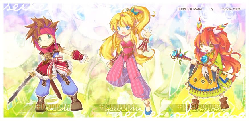
I know I might just be pointing out some things you've already caught yourself, but here's a few things I've noticed. I love the purple in the shading, however it seems odd that you only did it in the hair (save for Purimu, and even then it isn't throughout). The use of purple in the shading does take away the darkest darks in the hair, which is fine. It gives it a soft, almost "candy"-like feel which fits the style quite marvelously. However, in the clothing and skin tone, there is no purple and so the shadows don't have the bright purple to detract from the illusion of their depth. This makes the head and the body look strangely detached.
This isn't so much the case with the girl, but there's something else I've found about her that I feel I should address. You also use different shading styles in Purimu's pants than her top. That inconsistency makes the character as a whole look a little odd. In the pants you use an almost cell style shading technique, but in her torso you use a gradient. I see the darker pink you used on the outside of the purple, but it's not enough of a gradient to fit the use of purple in the hair or the shading in general.

That was a bit lengthy, but don't misunderstand: I love these a lot. The obvious skill in how you rendered everything is incredible. I hope to see more art from you. :D
User avatar
Dr. Sheexy
Site Admin
Posts: 3870
Joined: Sun May 21, 2006 9:49 pm
Location: Texas

Post by Dr. Sheexy »

Nice critique NightshadeTea, you've got some good points there.
Critiques like that one are great for advancing in artistic ability, good read.
Shuu
Green Drop
Posts: 67
Joined: Sun May 10, 2009 1:08 pm
Location: Philippines

Post by Shuu »

NightshadeTea, that post is love.

I'll try to fix it again later today based on what you posted. I guess my cellshading-to-painting coloring change shows a lot, and I was...subconsciously still using my old cellshading ways. Thank you thank you! : D
User avatar
manaman
Spikey Tiger
Posts: 1649
Joined: Tue Apr 10, 2007 5:06 am

Post by manaman »

Thanks!

I still want to buy a comic from you.

Peace,

manaman
Post Reply